One of the first challenges we faced when we started this project was the creation of a solid and versatile corporate image that could be adapted to different proposals

One of the first challenges we faced when we started this project was the creation of a solid and versatile corporate image that could be adapted to different proposals
We needed to transmit, on the one hand, security and trust, since working in the logistics sector, despite being a company that provides technology and not operations, we know that trust is a crucial factor in the sector. That is why we want our customers to see us as the technology company behind their shipments. But on the other hand, we are a startup and we didn’t want to lose that fresh and dynamic air that Tuklo
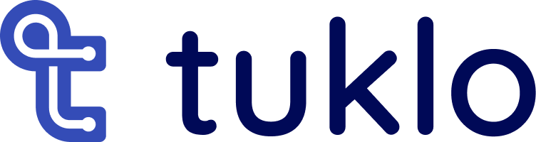
Furthermore, all our applications are part of the same ecosystem. This is very clear in the design of the user interface of the apps, since, without being the same, they do share clear style guides. We wanted to convey that sense of coherence, of the comfort you feel when you arrive at a recognisable place, with the different brands in the ecosystem. That is why our three products, Tuklo, Tukgo and Tuktu even share the logo glyph, focusing the differences between them on the colour code and the wordmark
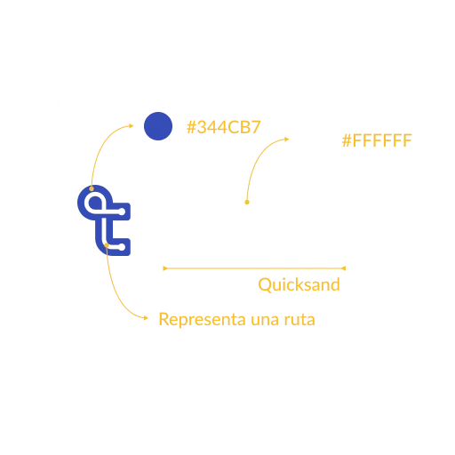
The glyph we have created represents a difficult but successfully solved route. We join dots, we join places regardless of the difficulty of the delivery. This icon, as well as representing a letter “t” for tuklo, is easy to break down into smaller pieces that can be used to make patterns or details
The typography of the wordmark is Quicksans. Its rounded and friendly shapes make it clear that we are dealing with a start-up, a young company that adapts to change. But at the same time it is very straight, indicating the seriousness and solidity necessary for the type of service we provide
Quicksand is also used for the titles in our publications, although it is accompanied by Lato for the texts, a correct, modern and easy-to-read typeface


Tuklo gives its name to the company and in turn to the control tower. We have chosen blue tones for the company and main solution with the aim of reflecting our seriousness in the day to day, which added to a logo with a curved style gives us the balance between reliability and closeness that defines us
Tukgo is the name of our last mile delivery solution. The green represents our strong commitment to preserving the environment and our belief that any logistics company can reduce its footprint while working with us


Tuktu is the name of our fast or scheduled delivery solution. Action, speed and urgency define on-demand delivery. Red is the colour of passion and movement, intrinsic values of tuktu